A halftone file is a promise: "this cell should be 40% ink". The printing process decides whether that promise is kept. Ink spreads, stencils lose tiny openings, and paper or fabric absorbs ink differently. The three controls in this guide — dot gain, minimum dot and maximum dot — let you plan for those effects instead of being surprised by them.
What is dot gain?
Dot gain (also called tone value increase, TVI) is the difference between the dot size in the file and the dot size on the printed result. A 50% dot that prints as 65% has 15% dot gain. It happens for physical reasons:
- Mechanical spread: ink is squeezed outward by pressure — the squeegee in screen printing, the blanket in offset.
- Absorption: ink wicks into paper fibres or cotton, spreading beyond the dot edge.
- Optical gain: light enters the paper between dots, scatters and is partly absorbed under the dots, making them look bigger than they are.
Dot gain is always strongest in the midtones. A 0% cell has no dot to spread and a 100% cell is already solid, but a 50% cell has the longest total dot edge — and every bit of edge spreads.
Compensating for dot gain
If you know that your process darkens midtones, make the midtones lighter in the file. That is what a negative dot gain setting does: it subtracts a curve that peaks at 50% and falls to zero at both ends, so highlights and solids are untouched. In this generator the value is the adjustment at 50%: −10% turns a 50% grey into a 40% dot.
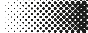 -15%
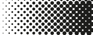 0%
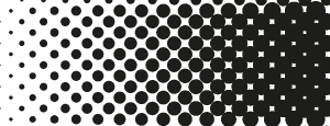 +15%
Typical starting points:
| Process | Typical gain at 50% | Compensation |
|---|---|---|
| Coated paper, offset | 10–15% | Handled by the RIP |
| Uncoated paper / newsprint | 20–30% | Handled by the RIP |
| Water-based ink, smooth fabric | 5–10% | −5% |
| Plastisol on cotton | 10–20% | −8 to −12% |
| Laser on wood | varies with power | −5 to −15% |
The best number comes from a test: print a step wedge (a strip of 10%, 20% … 90% patches), measure or eyeball how dark each patch prints, and adjust. Positive dot gain is useful too — as a creative control for heavier, inkier shadows in comic and pop-art work.
Minimum dot
Every process has a smallest dot it can reproduce. In screen printing the stencil cannot hold dots smaller than a couple of mesh openings; on DTF tiny dots hold too little adhesive; on a laser, a dot smaller than the beam spot is either a full spot or nothing. Without a limit, the lightest tones are rendered as dots that simply vanish, and the print jumps abruptly from "some tone" to "bare substrate".
The minimum dot setting handles this predictably. Any tone below the minimum is either raised to the minimum dot (if it is at least half of it) or dropped to zero. You lose a little highlight subtlety, but in exchange every dot you send to print will actually print.
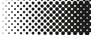 Min 0%
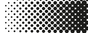 Min 10%
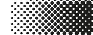 Min 20%
Maximum dot
At the other end, a 95% dot leaves only a tiny gap of paper or shirt between dots. Those gaps fill in with spreading ink, so 90–100% all print as solid, and shadow detail is lost. The maximum dot setting makes the decision explicit: tones above the maximum go fully solid, and everything below keeps a gap large enough to stay open. A maximum around 88–92% is typical for screen printing.
Putting it together
- Start from the process: pick cell size and angle (see the screen printing guide or DTF guide).
- Set minimum and maximum dots for what your process can hold.
- Apply dot gain compensation for your ink and substrate.
- Use brightness and contrast to place the important parts of the image inside the printable range — usually a little contrast boost after limiting.
- Print a test, compare, and adjust.
Why the generator measures coverage
All of this depends on one assumption: that a 40% cell in the file really is 40% ink. Simple halftone tools often scale dot radius linearly with darkness, which makes midtones too light and shadows too dark, and the error depends on the dot shape. This generator measures the real coverage of each shape on the repeating screen — including the overlap between neighbours in the shadows — and inverts it, so the numbers in these settings mean the same thing for dots, lines, squares, diamonds and crosses.
Quick reference
- Prints too dark / muddy midtones: more negative dot gain.
- Highlights missing: raise minimum dot or brighten the image.
- Shadows plugged: lower maximum dot or apply negative gain.
- Flat, grey print: increase contrast before limiting.
Experiment in the halftone generator — every setting updates the preview instantly.