Dots are not the only way to make a halftone. A line screen uses parallel lines instead: each line gets thicker where the image is dark and thinner where it is light, until it vanishes in the highlights. The result looks hand-engraved, and because every line is one continuous shape, it is perfect for vector work — plotters, laser cutters, vinyl and screen printing.
How a line halftone works
The image is divided into parallel rows, one per line. Along each row the generator samples the image at regular intervals (one cell apart) and sets the line's half-thickness so that the line covers the same fraction of the row as the darkness of the image. Between samples the thickness changes smoothly, and where the image becomes white the line tapers to a point and stops. Each continuous stretch of line becomes one closed vector path.
Coverage works the same way as with dots: a 30% grey becomes a line 30% as thick as the spacing; a solid black area becomes lines that touch.
Step 1: pick a good source image
Line halftones flatten a lot of detail, so the source matters:
- Strong lighting — portraits with side light, objects with clear shadows.
- Simple backgrounds — a plain or white background keeps the lines on the subject.
- Large shapes — the lines describe form well but lose small textures.
Step 2: choose the line spacing
Line spacing is the cell size: the distance between line centres. Fine spacing (6–8 px on a 1200 px image) looks like a photo from across the room; wide spacing (16–24 px) turns the image into a bold graphic where the lines themselves are the design.
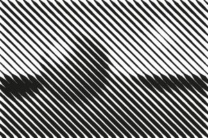 8 px spacing
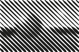 12 px spacing
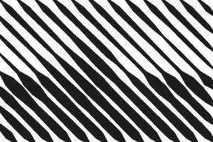 18 px spacing
For cutting machines and lasers, think about the smallest feature your machine can make. If the line spacing is 1 mm and the lightest tones are 10% thick, those lines are only 0.1 mm wide — too thin for vinyl. Raise the minimum dot or widen the spacing.
Step 3: choose the angle
Horizontal lines (0°) look like a TV scan line or a Op-art poster. Diagonal lines (30–45°) feel like classic engraving. Vertical lines (90°) work well on tall subjects. Try a few angles: the direction of the lines interacts with the edges in the image, and some angles flatter a face more than others.
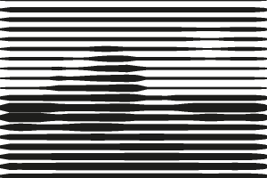 0°
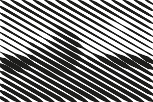 30°
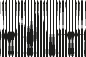 90°
Step 4: tune contrast and limits
Line halftones look best with a clear range of thicknesses. A contrast boost of 1.2–1.5 pushes light areas toward white (lines disappear) and dark areas toward black (lines merge), which gives the image more punch. A minimum dot of 10–15% removes hair-thin line ends, which matters for cutting and engraving. A maximum dot of about 90% keeps a sliver of space between lines in the shadows, which preserves the line character instead of merging into a solid block.
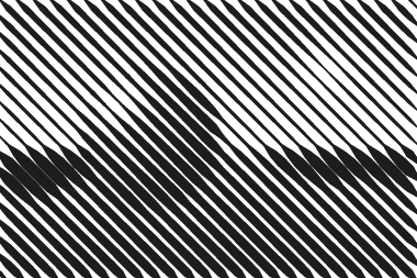 Contrast 1.0
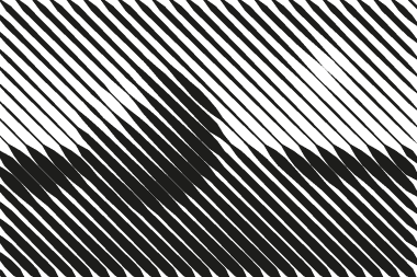 Contrast 1.4, min 12%
Step 5: export as SVG
Click SVG. The file contains one compound path per ink, wrapped in a group rotated to the screen angle, with a clip path to the image bounds. In practice that means:
- Illustrator / Affinity / Inkscape: open directly. To get one flat outline for cutting, release the clipping mask and use Pathfinder → Crop, or Intersect with a rectangle.
- Cricut Design Space: upload the SVG; it imports as a single layer. Weld if Design Space splits it.
- LightBurn / xTool Creative Space: import and set the layer to Fill. Because lines are closed shapes, the laser fills them rather than tracing the outline.
- Pen plotters: filled shapes need a hatch fill in your plotting software; or set a small cell with the minimum dot at zero and plot outlines only for a contour look.
Line halftones produce far fewer shapes than dot halftones — one per line run instead of one per cell — so files are small and quick to cut.
Variations to try
- Colored lines on a colored background: pick an ink and background color, e.g. navy on cream for a vintage print.
- Inverted: tick Invert and use white lines on a dark background for a neon or chalk look.
- CMYK lines: switch mode to CMYK with the line shape — four sets of colored lines at different angles create a woven, textile effect.
- Square or diamond: compare with the square and diamond screens for a more digital feel.
Line halftone vs line art tracing
Auto-tracing (Image Trace, Potrace) finds edges and fills regions with flat color; it keeps the outline of a shape but discards shading. A line halftone keeps the shading — the thickness of every line encodes the brightness — but has no outlines. The two can be combined: trace the outlines, then add a line halftone layer for shading, like a traditional engraving.
Ready? Open the line halftone generator, or read the introduction to halftones.