A printing press, a screen printer and a laser engraver all have the same limitation: at any point on the page there is either ink (or a burn) or there is not. They cannot lay down "40% grey". Yet a black-and-white newspaper photo clearly shows soft shadows and smooth skies. The trick that makes this possible is the halftone.
The basic idea
A halftone divides the image into a regular grid of small cells and places one solid mark in each cell — usually a round dot. The darker the original image is in that cell, the bigger the dot. In a light area the dots are tiny specks surrounded by lots of paper; in a dark area they grow until they touch and finally merge into solid ink.
Viewed from a normal distance, your eye cannot resolve the individual dots. It averages the ink and the paper inside each cell, and you perceive a continuous grey whose darkness equals the fraction of the cell covered by ink. A dot covering 25% of its cell reads as a 25% grey; one covering 80% reads as a dark grey.
 0 → 100% ink
That proportion — the dot area or coverage — is the single most important number in halftoning. A good generator makes the printed coverage match the original tone exactly. That is less trivial than it sounds: round dots start overlapping their neighbours at about 78% coverage, so simply making the dot radius proportional to darkness gives the wrong tones. Our halftone generator measures the real coverage of each shape on the repeating screen and inverts it, so a 40% grey becomes exactly 40% ink for every shape.
A very short history
Before halftones, newspapers could only print photos as hand-engraved illustrations. In the 1880s printers began photographing images through a fine glass screen ruled with crossed lines. Each opening of the screen acted like a tiny pinhole camera and produced a dot whose size depended on how much light came through. The result could be etched into a metal plate and printed alongside text. Later the glass screen became contact film, and from the 1980s onward, software and imagesetters calculated the dots directly. The terminology — screen, screen ruling, screen angle — still comes from those glass plates.
The settings that matter
Cell size and LPI
The spacing of the grid is called the screen frequency or screen ruling, measured in lines per inch (LPI). Newspapers print at around 85 LPI, magazines at 133–175 LPI, and screen-printed shirts at only 35–65 LPI because the mesh and ink cannot hold finer dots. In a pixel-based tool the same idea is the cell size: the distance between dot centres in pixels. At 300 DPI, a 6 px cell equals 50 LPI.
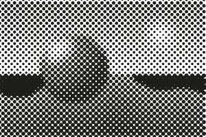 6 px cell
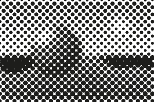 10 px cell
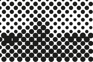 18 px cell
Smaller cells show more detail but produce smaller dots, which are harder to print. Larger cells produce a bolder, more graphic texture — the pop-art look.
Screen angle
The grid of dots is usually rotated. At 0° the rows of dots line up with the edges of the page and the eye picks them out easily; at 45° they are least noticeable, which is why 45° is the classic angle for black ink. When several colors are printed, each one gets a different angle so the screens do not interfere and create moiré. See our guide to CMYK halftone angles and moiré.
Dot shape
Round dots are the default, but there are alternatives, each with its own character:
- Round dot — classic print and comic look; dots touch at about 78%.
- Line — parallel lines that thicken in dark areas, like an engraving.
- Square — a crisp, digital or pixel-grid look.
- Diamond — corners meet at 50%, giving smoother midtones; similar to the elliptical dot used in commercial print.
- Cross — a graphic, textile-like pattern.
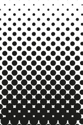 Dot
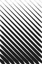 Line
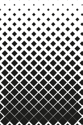 Square
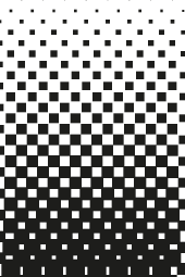 Diamond
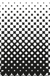 Cross
Dot gain, minimum and maximum dot
Ink spreads when it hits paper or fabric, so printed dots end up a little larger than planned. This dot gain darkens the midtones. Printers compensate by making the dots slightly smaller in the file. Processes also have a smallest dot they can hold (below it, dots disappear) and a largest dot before the gaps fill in. Read more in dot gain, minimum and maximum dot.
Halftone vs dithering
Dithering is a related technique that also turns grey into black and white pixels, but it scatters single pixels in an irregular or patterned way instead of growing dots on a regular grid. Dithering keeps more fine detail and suits screens, e-ink and thermal printers. Halftones are better for physical printing processes — screen printing, offset, DTF and engraving — because the dots are larger, regular and predictable. They also have a distinctive look that dithering does not reproduce.
Where halftones are used today
- Screen printing — every photographic or gradient T-shirt print is a halftone. See halftones for screen printing.
- DTF transfers — halftones let fades and shadows print without a solid white slab. See DTF halftones.
- Offset and digital print — the press RIP generates halftones automatically, so designers rarely see them.
- Laser engraving, vinyl and plotters — machines that can only mark or not mark.
- Design and illustration — comic, pop art, risograph and retro textures, where the dots are the point. Try the pop art preset.
Try it
The quickest way to understand halftones is to play with one. Open the generator, load a photo with a smooth gradient — a sky or a face — and drag the cell size and angle sliders. Switch the shape to Line or Diamond and watch how the midtones change, then switch the mode to CMYK to see the rosette pattern of a four-color press. Everything runs in your browser, and you can export the result as PNG or as a vector SVG.