Direct-to-film (DTF) printing has made full-color garment decoration cheap and easy: print the design on a PET film, cover it with white ink, dust it with hot-melt powder, cure, and press it onto almost any fabric. But DTF has one big weakness — it does not do partial transparency. Every pixel that has any color at all gets a full layer of white ink and adhesive underneath it.
Why soft edges print badly
Designs made for screens are full of semi-transparent pixels: drop shadows, glows, distressed textures, feathered edges and gradient fades. On DTF those pixels cause three problems:
- Visible boxes and halos. A shadow at 5% opacity is invisible on screen but still gets white ink, so you see a pale rectangle or halo on the garment.
- Muddy fades. A fade from solid color to transparent becomes a fade from color to pale color on a solid white slab — it never actually reaches the shirt color.
- Heavy, plasticky prints. Large solid areas of film, ink and adhesive do not breathe and are more likely to crack after washing.
How halftones fix it
A halftone converts every partially transparent area into a pattern of fully opaque dots with fully transparent gaps. The RIP then puts white and adhesive only under the dots. The garment shows through between them, so a fade really does fade into the shirt, and shadows look like shadows instead of grey boxes. Large halftoned areas are also lighter, softer and more breathable.
 10 px cell
 18 px cell
This is the same principle used in screen printing, where halftones have always been needed, and it is why "DTF halftone" Photoshop actions are so popular. You can do the same thing in your browser with our DTF preset.
Step-by-step
- Start with the right file. Export the part of the design that should be halftoned — a shadow, a distressed texture, a faded photo — as a PNG with transparency.
- Open it in the generator. Transparent areas count as "no ink", so the halftone respects your alpha channel automatically.
- Turn on Transparent background. Only the dots are exported.
- Choose the cell size. 6–10 px at 300 DPI gives a fine, subtle texture (30–50 LPI). 12–20 px gives a deliberate, visible retro dot.
- Set a minimum dot of 5–8%. Microscopic dots may not hold adhesive powder or may wash off.
- Set the output width. Print width in inches × 300 — 3600 px for a 12-inch-wide chest print.
- Pick an ink color and export the PNG, then recombine it with the solid parts of your design in your gang-sheet software.
How big should DTF halftone dots be?
DTF can reproduce surprisingly fine detail — far finer than screen printing — but there is a practical floor. Very small dots carry very little adhesive, and after a few washes they can lift. As a rule, keep the smallest printed dot above about 0.4–0.5 mm. At 300 DPI that is roughly 5–6 pixels across, which is why a minimum dot setting matters more than a tiny cell size.
| Look | Cell at 300 DPI | LPI | Min dot |
|---|---|---|---|
| Subtle fade, nearly invisible dots | 6 px | 50 | 6% |
| Classic halftone | 10 px | 30 | 8% |
| Bold vintage dots | 16–24 px | 12–19 | 10% |
Dark garments and inverted halftones
When the design is meant to glow on a black shirt — light rays, highlights, a white portrait — you want the dots where the image is light, not dark. Tick Invert and choose white (or any light color) as the ink. The dark parts of the image then become transparent, and the shirt itself provides the shadows.
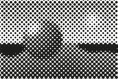 Normal
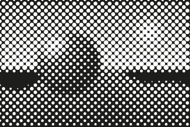 Inverted, white ink
Combining halftones with solid areas
You rarely want to halftone a whole design. Logos, text and bold shapes should stay solid for maximum opacity and durability. The usual workflow is to split the artwork: keep the solid parts as they are, halftone only the soft parts, then stack both in your design or gang-sheet software. Because the halftone layer is exported with transparency at the same pixel size, it lines up exactly.
PNG or SVG?
Most DTF RIPs and gang-sheet builders expect a PNG at 300 DPI, so PNG is the default. SVG is useful if you want to recolor the dots, scale the design to several sizes without re-exporting, or merge the dots with vector artwork in Illustrator or Inkscape. Both formats are generated in your browser, and your artwork is never uploaded.
Checklist before printing
- No semi-transparent pixels left outside the halftoned area.
- Halftone exported at the final print size, 300 DPI.
- Smallest dots at least 0.4–0.5 mm.
- Your RIP's own halftone or "choke" settings checked so they do not fight the file.
For more background on how halftones work, see what is a halftone, or compare with the screen printing guide.