With only 16 wool colors, a photo of a sunset has a problem: the sky’s smooth gradient from blue to orange has hundreds of colors in between, and the generator can only pick from 16. Without help, those gradients turn into flat bands. Dithering is the help — and it’s also the most common reason pixel art looks noisy.
What dithering does
Dithering mixes pixels of two or more available colors so that, from a distance, your eye blends them into a color that isn’t in the palette. A checkerboard of white and light blue wool reads as a pale blue in between. Newspapers, old video games and e-ink screens all rely on the same trick.
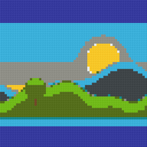 None
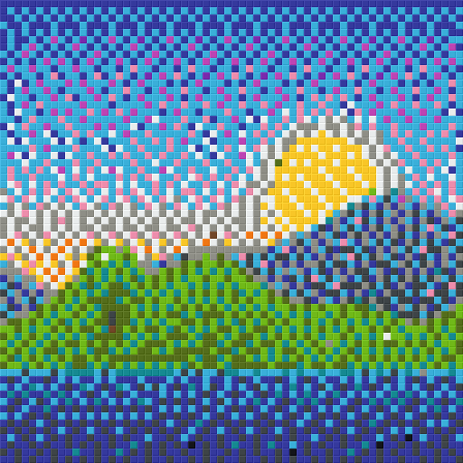 Floyd–Steinberg
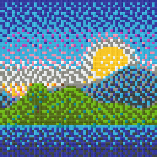 Atkinson
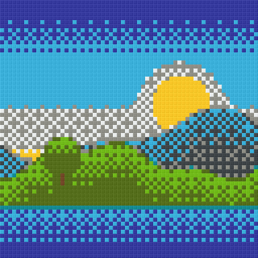 Ordered 4×4
The methods in this generator
- None. Every pixel gets the closest block. Large areas stay clean and solid. Best for sprites, logos, cartoons and anything already drawn with flat colors.
- Floyd–Steinberg. The classic error-diffusion method: the difference between the pixel and the chosen block is passed on to the neighbours to the right and below. Gives the smoothest gradients and the most faithful overall color, at the cost of a scattered “grain”.
- Atkinson. Passes on only part of the error, so it keeps more contrast and leaves solid areas cleaner than Floyd–Steinberg. A good compromise for illustrations and photos with strong shapes.
- Ordered 4 × 4. Adds a fixed, repeating threshold pattern. The result is regular cross-hatching rather than random grain. It looks deliberately retro and is easier to build because patterns repeat.
Strength
The strength slider scales how much error is diffused (or how strong the ordered pattern is). Lower strength keeps flat areas cleaner and only dithers where the image really needs it.
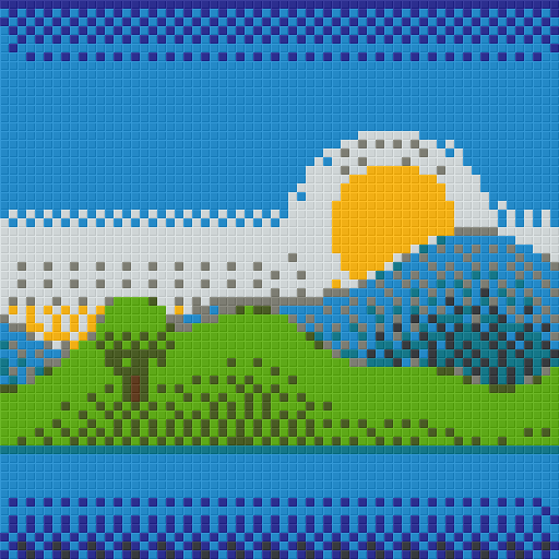 30%
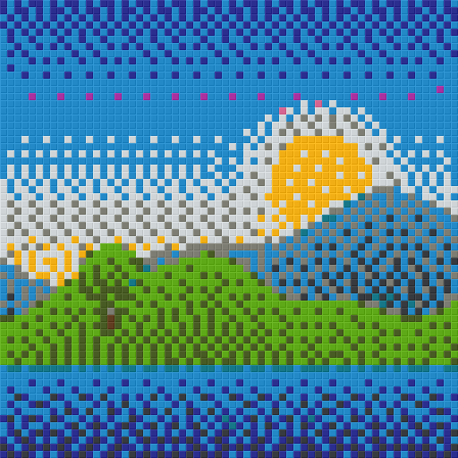 60%
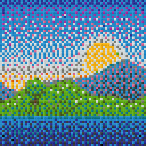 100%
Dithering costs building time
A row of 40 white blocks is placed in seconds. A row where the color changes every block takes several times longer, because you swap hotbar slots constantly and count every position. Dithered art also has more block types with small counts, which makes gathering harder. For survival builds, prefer “None” or a low-strength Atkinson.
In staircase map art, dithering has an extra cost: more frequent shade changes mean more steps up and down, which can make columns taller. Flat map art with dithering is often the best balance.
Preparing the image
A few minutes of editing before converting usually beats any dithering setting.
- Crop tightly. Remove background you don’t need; every pixel costs a block.
- Remove the background. Transparent pixels become air, so a PNG with the background removed builds only the subject.
- Increase contrast. Block palettes have fewer dark and light steps than a photo. A little extra contrast (110–130% in the generator’s Adjust image panel) keeps shapes defined.
- Boost saturation for wool and concrete. Their colors are vivid; slightly more saturation helps the image use them.
- Simplify small details. Text and thin lines thinner than one block will disappear or break up. Make them bolder, or make the build wider.
- Resize in whole steps for sprites. A 32-pixel sprite should be built at 32, 64 or 96 blocks — not 50.
Choosing for your image
| Image | Dithering | Palette |
|---|---|---|
| Game sprite, emoji, logo | None | Wool or concrete |
| Cartoon, illustration | None or Atkinson 50% | Concrete |
| Portrait photo | Atkinson or Floyd–Steinberg 60% | All full blocks |
| Landscape / sunset | Floyd–Steinberg | Concrete + terracotta |
| Map art photo | Floyd–Steinberg, flat mode | Map colors |
Dithering and map art palettes
Map art is where dithering earns its keep. The map palette has about 60 colors in flat mode, but many of them are muted earth tones and very few are bright pastels, so a photo of a blue sky or a skin tone often lands between two map colors. Error diffusion fills those gaps convincingly because maps are viewed small, in an item frame, where individual pixels blur together. On a wall you walk up to, the same dithering would look like gravel. If you build staircase map art, compare the tallest-column number in the info line with and without dithering: if dithering adds a lot of height for little visual gain, switch back to flat or lower the strength.
Compare before you build
Hold the Compare button in the generator to flash the original image over the block preview. If the preview looks noisy compared with the original, lower the dithering strength; if gradients look banded, raise it. Then check the material list: a dithered version often uses many more block types than a clean one, and that’s worth knowing before you start gathering.