Screen printing is a binary process. At every point of the design the stencil is either open, and ink goes through the mesh, or closed. There is no way to print 40% black, so tones have to be faked with patterns of solid dots that the eye blends at a distance. Printers have two families of patterns to choose from: halftones and dithering.
Dither vs halftone: AM and FM screening
A halftone places dots on a regular grid — say 45 lines per inch at a 22.5° angle — and varies the size of each dot: small dots for highlights, large merging dots for shadows. Because the information is in the dot size, printers call this amplitude-modulated (AM) screening. It is the classic look of comics and newspaper photos, and it is very forgiving on press because each dot is a solid round shape. If you want that look, use a dedicated halftone generator such as the halftone tool on feeed.top.
Dithering keeps every dot the same size — one pixel — and varies how many dots there are. Dark areas get many pixels, light areas few. That is frequency-modulated (FM) or stochastic screening. Error diffusion algorithms such as Floyd–Steinberg and Atkinson scatter the pixels organically; ordered dithering such as Bayer arranges them in a repeating crosshatch.
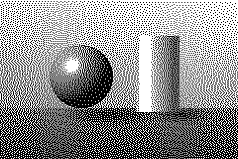 Floyd–Steinberg
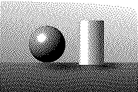 Atkinson
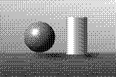 Bayer 8×8
| Halftone (AM) | Dither (FM) | |
|---|---|---|
| What varies | Dot size, fixed grid | Dot count, fixed size |
| Look | Visible rosette or line pattern | Fine grain or retro crosshatch |
| Moiré with the mesh | Possible — needs the right angle and LPI | Rare with error diffusion; possible with Bayer |
| Smallest printed dot | Highlight dots shrink and can fall through the mesh | Always one pixel, so it is chosen to be printable |
| Detail | Limited by LPI | Higher at the same mesh, sharper edges |
| Best for | Vintage, comic, pop-art prints | Photos, simulated process, index separations, retro pixel style |
Size the pixels for your mesh
The one rule that matters: a single dither pixel must be big enough to be held by the mesh. If it is smaller than about two thread spacings, it either closes up in the emulsion or prints as an unsupported speck that washes out. So instead of thinking in DPI, work backwards from the mesh count (threads per inch).
| Mesh count | Thread spacing | Dither resolution (≈ mesh ÷ 2) | Pixel size | Halftone LPI (≈ mesh ÷ 4.5), for comparison |
|---|---|---|---|---|
| 110 | 0.23 mm | 55 ppi | 0.46 mm | 24 |
| 156 | 0.16 mm | 78 ppi | 0.33 mm | 35 |
| 200 | 0.13 mm | 100 ppi | 0.25 mm | 44 |
| 230 | 0.11 mm | 115 ppi | 0.22 mm | 51 |
| 305 | 0.08 mm | 150 ppi | 0.17 mm | 68 |
These are starting points, not laws: emulsion thickness, exposure, ink and fabric all shift them. Print a test strip with your usual setup before committing a big run. Notice how dithering can use roughly twice the resolution of a halftone on the same mesh — that is why fine detail and small text survive better.
Worked example
You want a 10 × 12 inch print on a 156 mesh screen. At 78 ppi the artwork needs to be 780 × 936 pixels at the moment it is dithered. In DitherImage, scale your source so that width ÷ pixel size ≈ 780: for a 1,560-pixel-wide photo set Pixel size to 2. Dither, then export at 4× so the film output has crisp square pixels, and set the image to 10 inches wide in your layout or RIP software — never let the RIP resample it, or the clean single pixels turn into gray mush.
Choosing an algorithm for film
- Atkinson is the safest error diffusion for screens. It only passes on three quarters of the error, so highlights become clean paper and shadows solid ink, leaving fewer isolated specks that are hard to expose.
- Floyd–Steinberg keeps more midtone detail but produces more single isolated pixels in the lightest and darkest areas. Raise contrast 10–20% so those areas clip to solid.
- Bayer 4×4 or 8×8 gives a deliberate retro crosshatch and very predictable dot gain, because every tone always uses the same pattern. Watch for moiré against the mesh on fine settings; a larger pixel size usually cures it.
- Threshold is not dithering at all — use it for stencil-style, two-tone art with no gradients.
Whichever you choose, check the result at 100% zoom. If you see lots of lonely single pixels in near-white areas, lower brightness or raise contrast until they disappear; they will not hold on press anyway.
Index color separations
For multi-color prints, dithering does something halftones cannot: index separations. You choose a small palette of real ink colors, dither the image to exactly those colors, and each color becomes one screen. Because every pixel is one solid ink, nothing overlaps and there is no trapping to worry about, which makes index seps popular for photos on light garments.
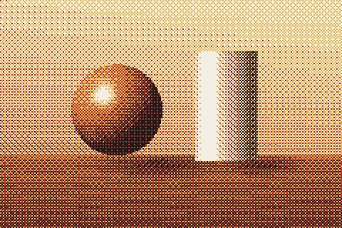 4 inks, Bayer 4×4
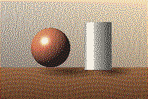 4 inks, Floyd–Steinberg
- Write down the hex values of the inks you will use (match them to your ink swatches as closely as you can) and paste them into Palette → Custom palette (hex list). Include the shirt color if it will show through as a "color".
- Pick a pixel size from the mesh table above — every screen in the job should use the same mesh for index work.
- Choose Floyd–Steinberg for a smooth photographic result or Bayer for a graphic look, then export an Indexed PNG: every pixel is guaranteed to be one of your palette colors.
- In your separation software select each color in turn (select by color, tolerance 0) and output it as a black film positive.
- Print the lightest ink first and the black last, with tight registration — index seps are unforgiving of misregistration because the pixels sit next to each other rather than on top.
Common problems
- Muddy, dark print: dot gain on press makes every pixel grow. Lighten the image 10–15% before dithering, or step down one pixel size.
- Highlights disappear: isolated light-area pixels did not expose. Use Atkinson, or reduce Dither strength slightly so highlights clip cleanly.
- Visible pattern or moiré: switch from Bayer to error diffusion, or increase pixel size so the pattern is clearly larger than the mesh.
- Jagged soft edges: that is the pixel grid — it is part of the dithered look. If you need smooth vector edges, keep text and line art on a separate, non-dithered layer.
Related reading: what dithering is and how it works, Floyd–Steinberg vs Atkinson and the 1-bit image converter for single-color films.