The original Game Boy launched in 1989 with a tiny screen that could show just four shades of olive green at a resolution of 160×144 pixels. Those limits produced one of the most recognisable looks in gaming — and it is surprisingly easy to recreate with any photo.
The authentic Game Boy palette
The original model (often called the DMG) displayed four shades of green. The most widely used approximation is:
| Shade | Hex |
|---|---|
| Darkest | #0f380f |
| Dark | #306230 |
| Light | #8bac0f |
| Lightest | #9bbc0f |
These are built into the Game Boy palette in DitherImage. Because they form a ramp from dark to light, the tool maps your photo's brightness onto them — color in the original doesn't matter, only luminance.
Step 1: Pick a good photo
With only four shades, simple images work best:
- One clear subject — a face, a pet, a building, a car.
- Strong lighting with visible shadows.
- An uncluttered background.
Crop tightly around the subject. Portraits work beautifully at square or near-square ratios.
Step 2: Get the resolution right
Authenticity comes as much from the chunky pixels as from the palette. The Game Boy screen was 160×144 pixels; the Game Boy Camera captured photos at 128×112.
In DitherImage, use the Pixel size slider to reduce resolution. For a typical phone photo resized to about 1000 pixels wide, a pixel size of 6–8 gets you close to Game Boy resolution. Watch the size readout under the controls — aim for 128–160 pixels across.
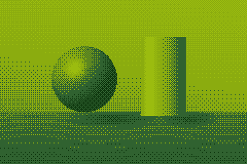
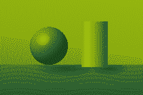
Step 3: Choose the dithering
 Bayer 4×4
 Floyd–Steinberg
 No dithering
- Bayer 4×4 — the regular crosshatch pattern that game artists used by hand. Best for an "in-game graphics" feel.
- Floyd–Steinberg — a more organic dot pattern, much like photos from the Game Boy Camera accessory.
- No dithering (Threshold) — flat posterized areas, like hand-drawn sprites. Works for simple, high-contrast subjects.
Step 4: Adjust brightness and contrast
Four shades leave little room for subtle tones, so contrast is key:
- Increase contrast to 120–140% to separate the subject from the background.
- Adjust brightness until the face or subject sits in the two lighter shades, with shadows in the darker two.
- If the image looks noisy, lower Dither strength to 60–80% for flatter, more sprite-like areas.
Step 5: Export at a crisp size
A 160-pixel image is tiny on a modern screen. Export at 4× or 8× — DitherImage uses nearest-neighbour scaling so every pixel stays a sharp square. Never upscale with a normal image editor, which will blur the pixels.
Variations to try
 Classic green
 4-level gray
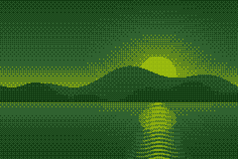
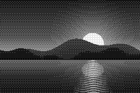
- Gray handheld look — use the 4-Level Gray palette for a look closer to later monochrome handhelds.
- Custom 4-color ramps — many emulators and modern handhelds offer alternative palettes (blue, red, sepia). The Custom duotone palette lets you design two-color versions.
- Full-color retro — for a later 8-bit color look, try the PICO-8 palette with pixel size 4–6.
Why four shades look so good
It may seem surprising that such a limited palette produces such appealing images. The reason is that our eyes care far more about brightness structure than about precise color. As long as the main shapes — face, hair, background — land on different shades, the brain fills in the rest. Dithering then supplies the in-between tones, so a gradient across a cheek still reads as a smooth curve.
The green tint also helps. Monochrome images in a single hue feel cohesive and stylised, which is exactly why duotone effects remain popular in graphic design. The Game Boy palette is essentially a ready-made four-step duotone with built-in nostalgia.
Common mistakes
- Too much resolution. A 1000-pixel-wide image in Game Boy colors looks like a filter, not like a Game Boy. Reduce the resolution until individual pixels are clearly visible.
- Too little contrast. If the subject and background have similar brightness, they merge into the same shade. Boost contrast or choose a photo with a plain, contrasting background.
- Blurry upscaling. Resizing the result in a photo editor with bilinear or bicubic scaling smears the pixels. Use the 4× or 8× export, or set your editor to nearest-neighbour.
- Saving as JPEG. JPEG compression adds blotchy artifacts between the four colors. Always use PNG.
Using the result in games and pixel art
If you are making sprites or backgrounds for a real Game Boy-style game, treat the converted photo as a reference rather than final art. Trace over it at the target resolution, keep the strongest shapes, and replace noisy dithered areas with deliberate patterns — artists of the era often used a simple checkerboard for 50% tones and sparse dots for 25% and 75%. The Bayer 2×2 and 4×4 settings produce exactly these patterns and are a good starting point for hand-cleaned art.
Ideas for your Game Boy photos
- Profile pictures and avatars for Discord, Twitch or GitHub.
- Album or playlist covers.
- Pixel-art references for game sprites.
- Printed stickers, posters and gift cards.
- Wedding or birthday invitations with a retro-gaming theme.
Recipe
Classic portrait: crop square around the face, Game Boy palette, Bayer 4×4, pixel size to reach ~144 px wide, contrast 130%, export at 8×.
Ready? Open the Game Boy converter and drop in a photo — it's free and runs entirely in your browser.